What is the Charts Dashboard?
The Charts Dashboard displays a project’s Status information, which is useful for all those involved in the project’s development.
The Charts Dashboard displays a graphical representation of the data in the form of Bar or Pie charts.
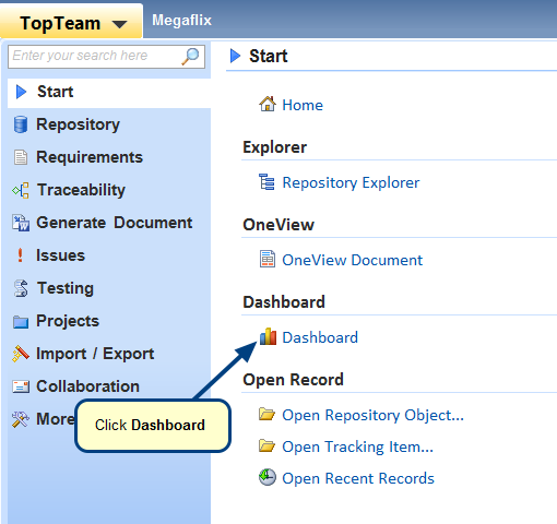
You can access this tab from TopTeam main menu > Start > Dashboard. Refer to the image below.

Charts Dashboard
The following samples are charts that can be displayed:
When to use it?
Use the Charts Dashboard for interpreting your data. The Charts Dashboard consists of:
- Bar charts (and Column charts) – Used to display one component against another or several quantitative components. E.g. Use Cases assigned to me by “State” and “Priority”.
- Pie charts – Are ideal for showing data that has a number of components and only one quantitative component. E.g. Use Cases assigned to me by “Priority”.
Getting Started
You can access online help for the Charts Dashboard from the link below:
Video – Getting Started with Creating and Modifying Chart Portlets in Dashboard